Friday, December 9, 2011

Tea Tree


Colored Pencil on Watercolor Paper 
8" x 11"

For my sixth concentration piece I did this piece with a colored pencil medium. I chose this picture, which I took, because I like the composition of the cups with the fabric in the foreground of the piece. I used a contrast of different colors and shades to create depth and realism to this piece. I used both warm and cool colors to create unity through out the entire drawing. The blurred background creates and expressive quality of movement. The repetition of handles and shapes of the cups creates harmony through out the piece. The negative spaces create depth and interest to the viewer. This piece is photo-realism and looks better than the actual picture because it the hues are much brighter and interesting. The soft edges in the background make it appear that there is some activity; however, it does not distract the viewer from the obvious point of interest. 

Monday, November 28, 2011

Concentration #5


Colored Pencil on Watercolor Paper
7.25" x 11.25"

For my fifth concentration piece I chose to draw a picture of my good friend Lauren as she is drinking a cup of tea. I feel that this piece has a nice balance of warm and cool colors. The dark contrast on her face allows the cup in her hand to be the center of interest. The bright colors and unordinary colors of the cup create emphasis on the center of interest; therefore, the tea cup is clearly the focal point of the piece. The expressive qualities of the piece create warmth and comfort to the viewer, and the piece makes you just want to drink whatever she is drinking. The highlights on her face make it clear where the art source is coming from. The variety of hues in her hair create movement and depth. My corrections included adding some of the colors from the cup into her hair to create balance and repetition throughout the entire piece.

Tuesday, November 15, 2011

My Concentration

A concentration is defined as "a body of work unified by an underlying idea that has visual coherence." A concentration shows evidence of thinking and a clear focus. A strong concentration must be connected between the work presented and the idea described. It must be interesting and attract the viewer. The artist must show something interesting with feeling and risk. An AP Art concentration consists of twelve pieces based on the investigation of a theme, object, or subject.

I chose to do my concentration on antique china. As I have progressed, I have began to focus more on tea cups. I have always been very intrigued by antiques. I think that fine china is very beautiful; and I enjoy drawing still lives. I am extremely passionate about the history and beauty of these simple pieces of china; therefore, I have been able to demonstrate my concentration in several different ways. I enjoy finding all of the different pieces and seeing how unique and beautiful they are.


Colored Pencil on Watercolor Paper
10.5″ x 8.5″


Colored Pencil on Watercolor Paper
10″ x 9″


"Gypsy Tea"
Colored Pencil on Watercolor Paper
11″ x 7″


Colored Pencil on Watercolor Paper
7.25″ x 11.25″

Friday, October 28, 2011

Charcoal tutorial

I would really like to redo my first piece and improve my charcoal portrait skills; therefor, this is the link to a video that demonstrates charcoal portrait drawing.


www.youtube.com/watch?v=IFEIJMzAZK4

Summer Art 3


My final summer art piece is a still life of a pair of sunglasses placed on top of some books. This art piece is titled “Summer Reading.” I chose to draw this still life because we were given the choice to draw something ordinary in an unordinary place. I felt that, it being summer, the sunglasses would appear random and unordinary among a pile of books, because when wearing sunglasses, especially inside, it can be difficult to read. This piece has a high light on the left lenses, which comes from the light source. It allows the books under the glasses to be apparent behind the dark lenses of the glasses. This photo-realism art piece is done from a real life, still life. The point of view emphasizes the interesting lines and shapes of the glasses. The Harmony apparent among the books makes the viewer know that all of the objects in the background are books. The contrast of the glasses makes them the center of interest, or focal point, because they are generally the largest and darkest aspects of the pencil drawing. In this piece, I struggled with makes the background as interesting as the focal point. I drew them with hard edges at first, but I feel that by adding the lamp base to the background, it made the piece more interesting and not as isolated. It added something interesting to the boring negative space. 

Summer Art 2


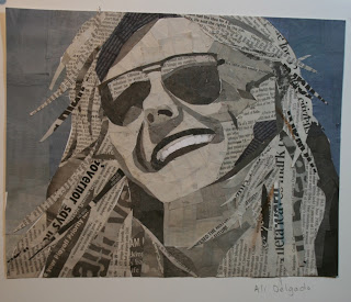
My second art piece was done with newspaper clippings, known as a collage, and it is a picture of my friend Taylor. I was very satisfied with this piece, because I feel that I captured the different value changes on her face with the use of Newspaper accurately. The shadows and highlights on the face are visible, and the hair is broken up and appears realistic because of the detailing and strands of hair depicted. The broken up paper clippings create movement and express the realistic idea that her hair is blowing in the wind.  The background, being different shades of blue hues, adds interest and depth to the art piece. It also adds isolation and perspective to the art piece. The gradual change in shades of blue creates perspective. As the hue of the blue becomes lighter, she appears to be farther back; therefore, the right side of her face appears to be closer from the viewer’s point of view. At first, I struggled with the proportions of her nose and face; however, I feel that I was able to work out those problems. 

Summer Art

For my first summer art assignment, I decided to explore charcoal on brown paper. For this project, I chose to use a draw my cousin, Keeli. The picture I chose ended up not being suitable for the assignment, and the art piece did not hold very high expectations. Therefore, I chose to discard the assignment and not use it. The proportions and highlights on the face were not accurate and they appeared awkward. I distorted her face and there was not a good contrast of lights and darks on her face to make the art piece interesting enough.